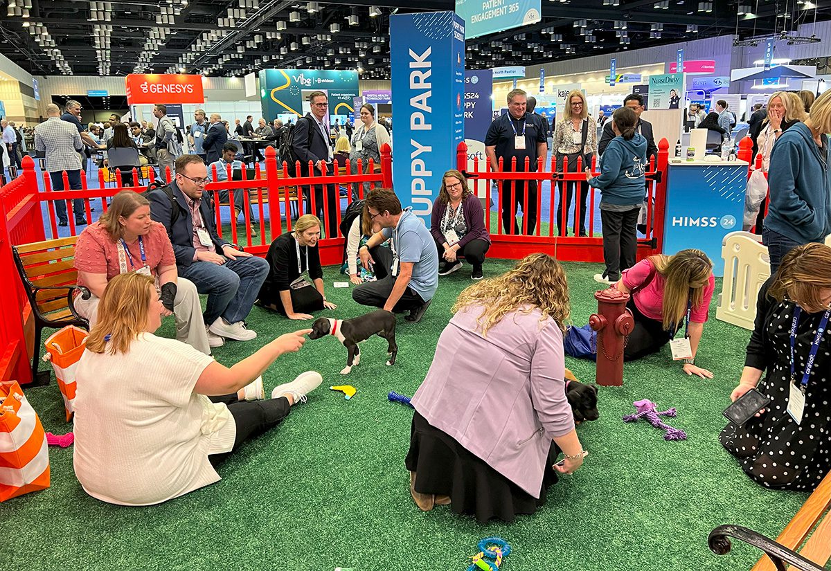
The Puppy Park on the show floor was a popular spot.
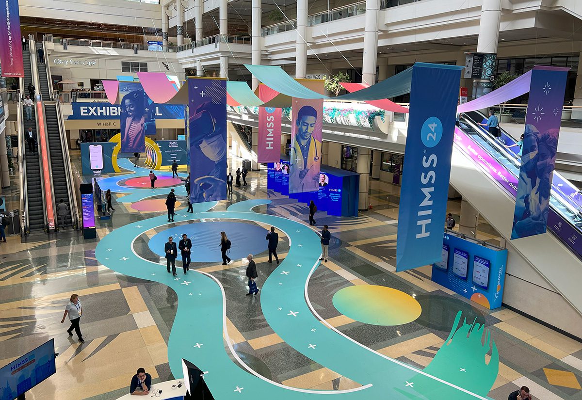
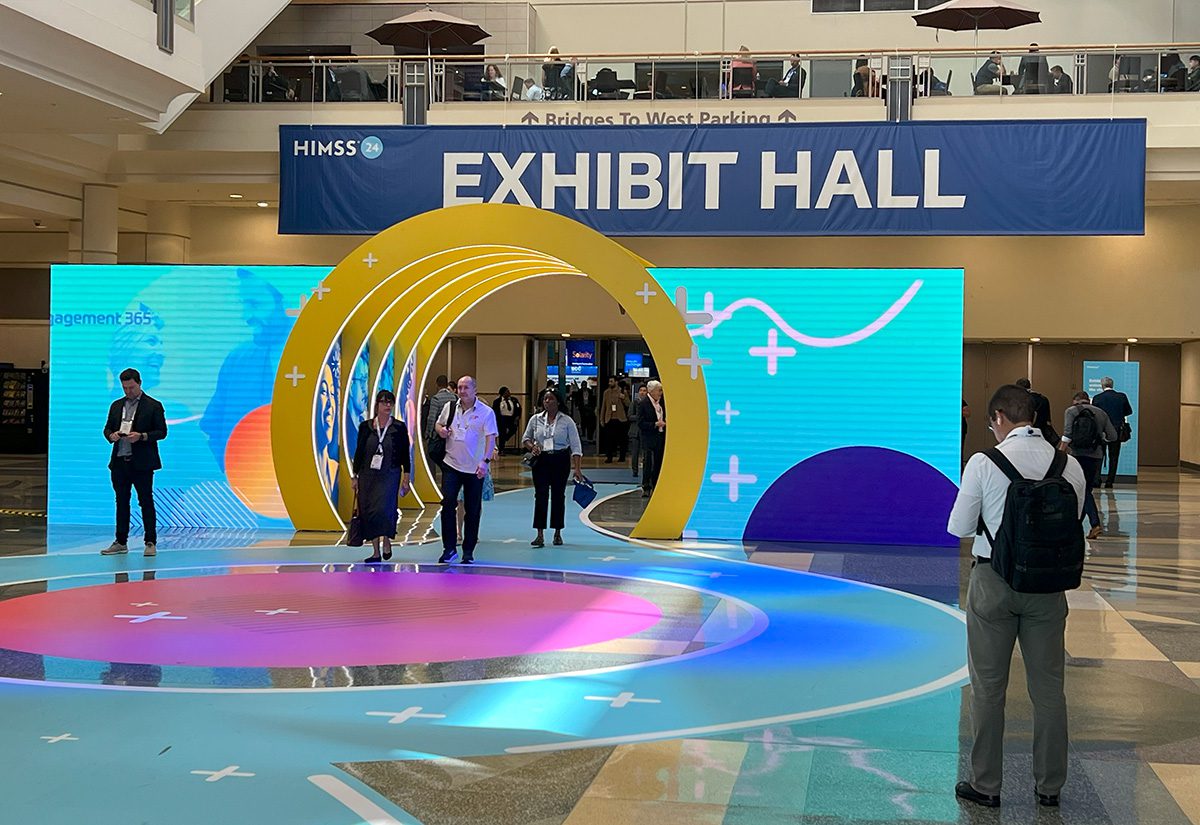
Centered on the theme of “Creating tomorrow’s health,” HIMSS24 delivered on bringing together an expansive showcase of the latest digital health innovations and technologies. More than 1,000 exhibitors presented their devices and services at Orlando’s Orange County Convention Center, March 11-15.
AI in health care was the top conversation topic heard across the show floor, and there was no shortage of free coffee to go around as more than 30,000 professionals powered through the 1.1 million-square-foot exhibit hall. And those lucky enough to catch one of several Syniverse-sponsored Häagen-Dazs ice cream carts stationed around the show floor got an extra sweet treat, in addition to the doughnuts and popcorn exhibitors served up in their booths. Back for a second year, the Puppy Park was an active zone for attendees looking to break away for playtime with four-legged friends.
HIMSS24 brought health IT solutions to life through a vibrant, multifaceted exhibition environment. Below, we rounded up 17 booths that pulled us in.
 MORE TRADE SHOW FLOOR COVERAGE:
- Exhibit Trends at HIMSS24: Scavenger Hunts, Techy Coffee Bars, Gamification
- Field Report: 10 Top Exhibits at Design & Construction Week 2024 in Las Vegas
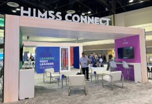
HIMSS CONNECT
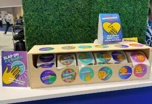
At its own booth, HIMSS set up modular meeting spaces made up of enclosed conference rooms with colorfully accented glass panels and large-graphic walls, wooden rectangular arches with affixed TVs and digital signage, and plenty of tables, chairs and countertops for members to chat and pull out their laptops. At the booth’s information desk, attendees could pick up stickers to wear with phrases and icons that spoke to them, such as “This Barbie is fixing health care,” “Medically opinionated,” “First-timer, I’m new here” and “0% paper, 100% digital.”
SURESCRIPTS
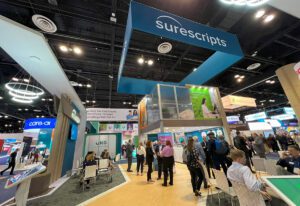
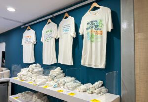
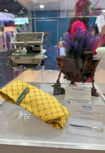
Surescripts’ two-floor build offered a private conference room upstairs and an engaging exhibit below. To drive home the benefits of its e-prescribing platform and how it’s working toward a #FaxlessFuture, Surescripts leaned into anti-fax messaging with t-shirts on display that included phrases like “I love to fax, said no one ever.” Attendees could choose their favorite of four designs to take home. The ArtiFax exhibit presented useful objects built by artist Josh Weston from old fax machine parts that were given a second life. Glass cases contained items such as a tie clip, a plant holder, jewelry and a robot, each with its own placard.
PHILIPS
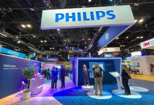
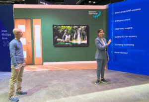
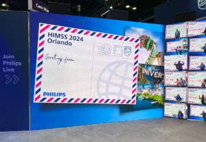
Philips’ booth was illuminated from above by blue lighting and featured a mix of wood and carpet flooring. A microphone-equipped host elevated on a circular platform drew passersby into a demo space that faced out toward the show floor aisles. Three screens positioned on their own circles in front of the live presenter gave participants the chance to interact with Philips’ products. Across the footprint, Philips Live presentations were led by experts, and when not in use for programming, the space doubled as a photo op, with the screens displaying a HIMSS 2024 Orlando postcard reading, “Greetings from…” On a tablet, participants entered their name to appear on screen. Brand ambassadors took their photo, which popped up on an adjacent display showcasing the collection of recent photos.
SALESFORCE
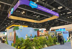
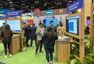
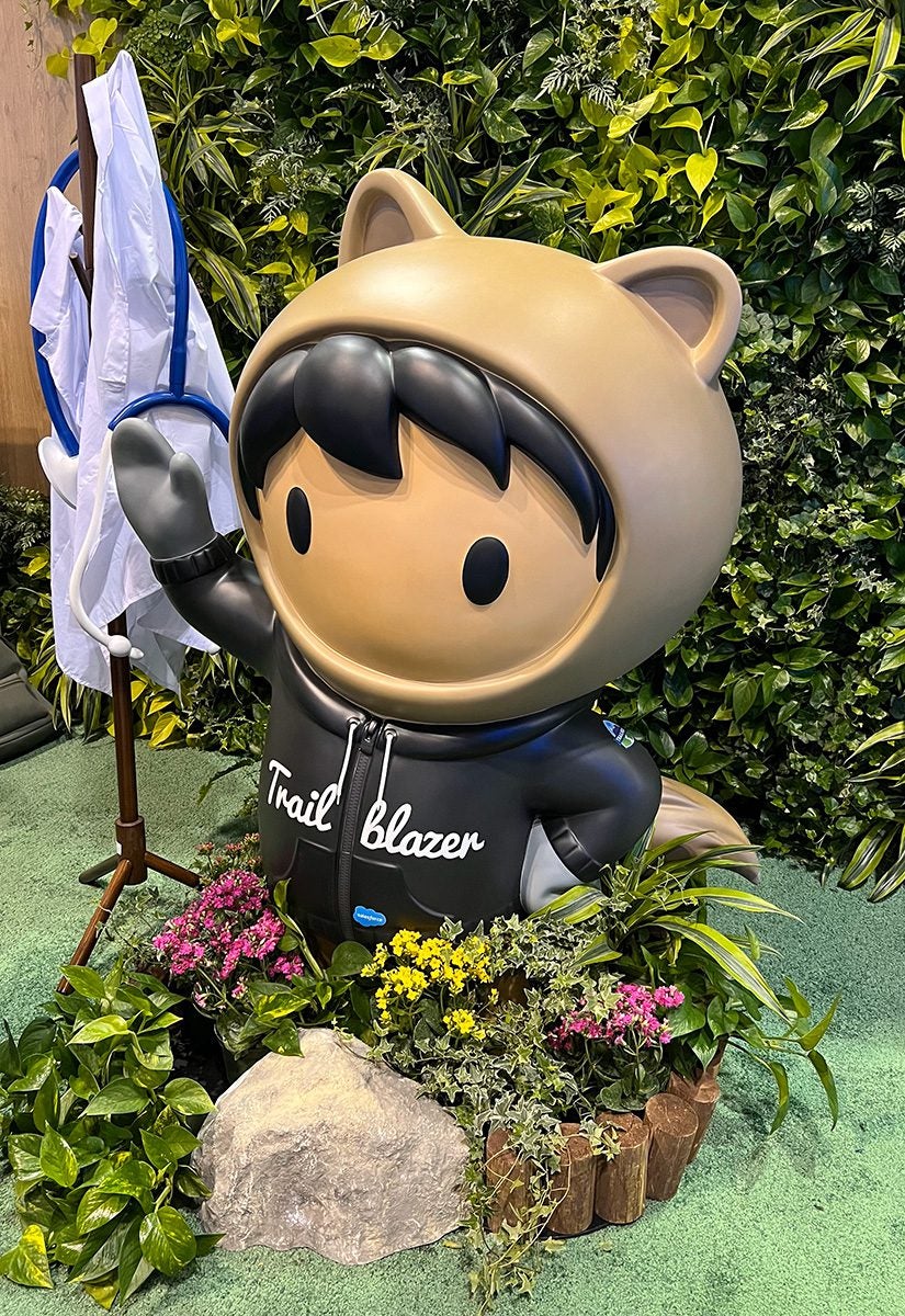 Salesforce immersed attendees in a forest environment on the show floor through green carpet that simulated grass, walls of draped leaves, wooden display structures, and plants, trees and rocks embedded under demo kiosks and around the booth’s edges. Blue-sky walls with cartoonish graphics of clouds, trees, mountains, butterflies and colorful hot air balloons (some with “I love AI” messaging) continued the outdoor theming. A life-size figure of Salesforce’s Astro mascot dressed in a black Trailblazer hoodie and surrounded by flowers and a coat rack with a hanging white lab coat and stethoscope created a fun photo op for attendees, particularly participants of the brand’s scavenger hunt who earned their own mini Astro plush. (Get all the details here.)
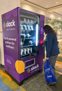
Slack also had a presence at HIMSS24 with a vending machine on the concourse outside the exhibit hall, near the education session rooms. Attendees who scanned their badge at the machine received a random prize drop. We came away with a Slack-branded case of reusable utensils.
EPIC
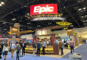
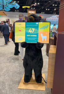
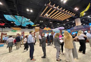
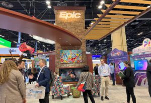
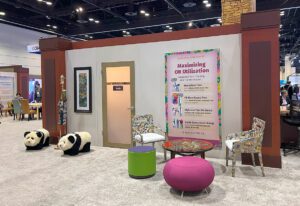
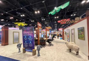
Living up to its brand name, Epic’s booth was truly epic. The largest in the exhibit hall and the most outlandish of all the booths we visited, the software company assembled a quirky collection of animal statues, figurines and plush; gargoyles and trolls; framed artwork and canvases of dogs, cats, flowers and astronauts; and eclectic tables and chairs that were dispersed around the widespread footprint. For instance, outside the Jungle conference room stood a glasses-wearing giraffe in a bathrobe holding a newspaper and a coffee mug, flanked by two panda bears. Fabric multi-colored and -patterned butterflies and dragonflies hung above the booth, along with wooden slats. A double-sided faux fireplace rounded out the “wild” design. Epic’s booth is one that attendees, and even other exhibitors, look forward to seeing each year at HIMSS, with several people encouraging us to stop by. We weren’t disappointed.
HELLOCARE
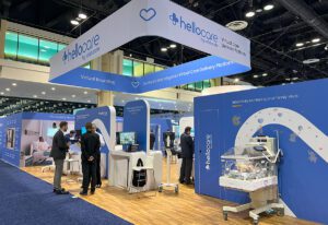
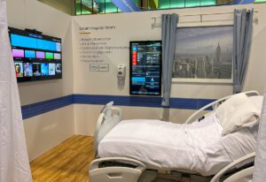
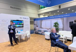
At a health care trade show, it was surprising that there weren’t more hospital-themed booths, but hellocare was one of the few that duplicated a realistic medical center environment. The French-headquartered exhibitor segmented its booth into different areas found on a hospital floor to show how its virtual care delivery platform can be integrated, from a NICU to a patient’s room to nursing stations. The wood floor, faux windows showing cityscapes, and blue accents from the hellocare logo broke up the sterile design of white curtains, beds, chairs, tables and couches. A waiting room also served as meeting space.
MICROSOFT
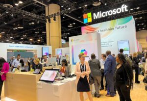
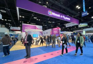
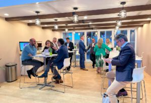
In addition to its standalone booth showcasing health care cloud and AI solutions, Microsoft put down a long, logoed decal on the aisle floor that guided attendees to its connected booth on Nuance clinical applications. Following the ombre path that transitioned from white to purple (the Nuance booth’s color scheme), attendees could engage with live demos, speak with technology experts and step inside the Copilot Theater that presented a 20-minute curated experience of Microsoft Copilot and Nuance solutions. While the Microsoft booth’s modern design carried over into the Microsoft + Nuance booth, a highlight was its open, coffee shop-esque meeting room with a beverage bar, window panels, wood beams on the ceiling and small overhead lighting fixtures.
ORACLE
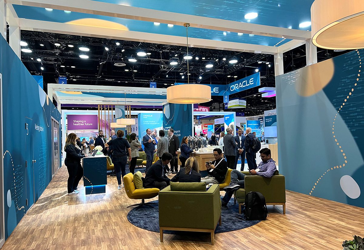
Next door, Oracle brought beachy vibes to its large booth footprint with shades of teal and yellow splashed across its displays. Circular carpets and dimmed overhead lamps matched the graphics on nearby walls, and blue glass panels above open meeting spaces, instead of traditional ceilings, created a calming environment.
SAMSUNG
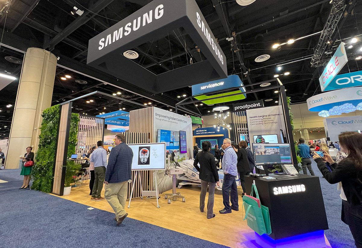
Split into two spaces, Samsung’s booth brought nature into a hospital setting. The first area was designed like a classic hospital room with TV screens and digital displays to show off the brand’s connective technologies. Moving into the next room, attendees enjoyed a coffee bar and seating while surrounded by potted plants. Overgrown greenery walls with the Samsung logo implanted and partial walls made up of vertical wood slats divided the spaces and created separation from the show floor aisles. Samsung employees said it was the best designed booth they’ve ever had at HIMSS.
ACCENTURE
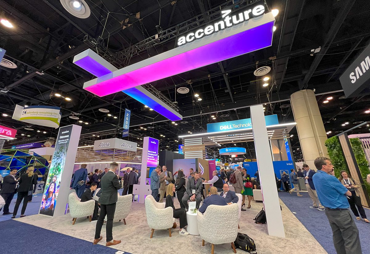
Unlike Samsung, Accenture opted for a fully open booth without wall dividers. Tall, thin standing digital displays and pink-and-purple illuminated bars with the company logo overhead added bright color to the area. But the booth’s winning feature was its collection of white fuzzy plush chairs. While others opted for sleek leather or plastic seating, Accenture leaned into comfort and texture.
AT&T BUSINESS
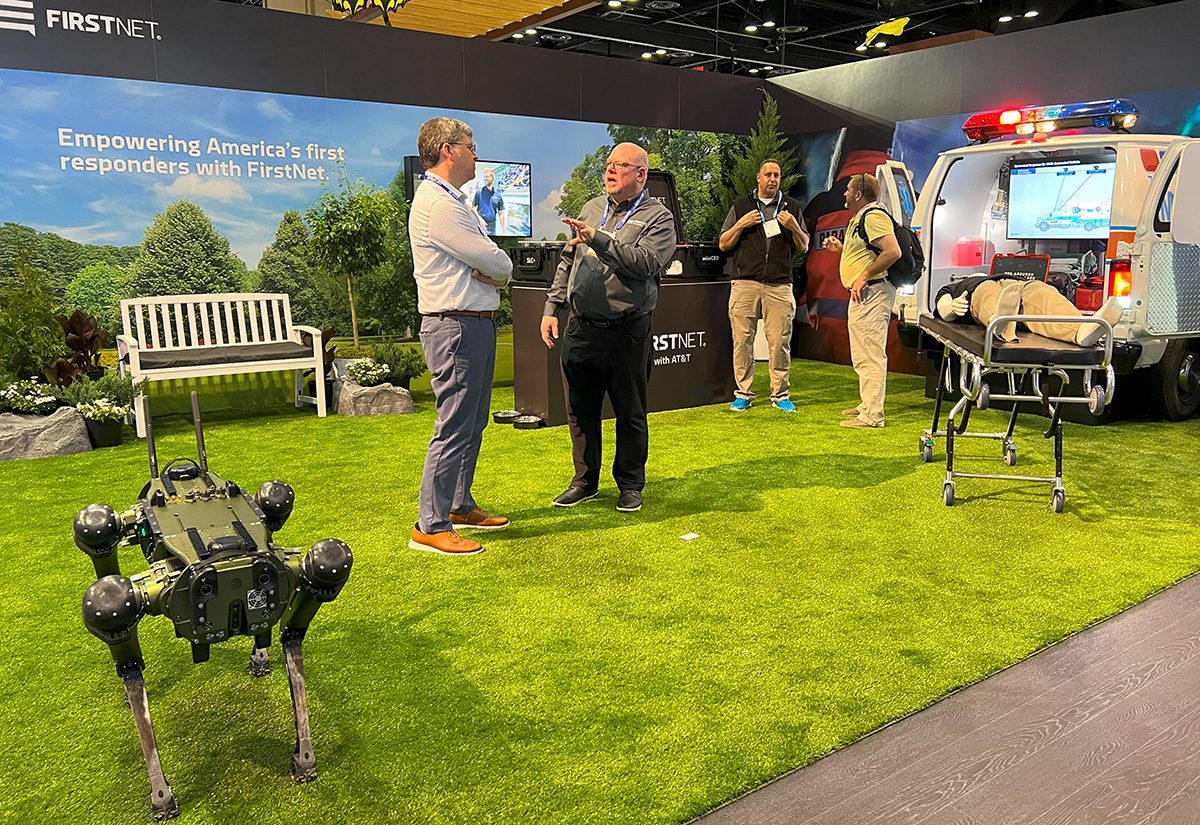
AT&T Business presented its fiber and 5G networks through an open booth footprint that featured a replica hospital room and meeting area, but it also included an exhibit on FirstNet that could have stood alone as its own booth. A network built with AT&T for first responders and those who support them, FirstNet distinguished itself with an outdoor design that included grassy carpet, a bench, rocks and potted plants that brought to life the surrounding backdrop of realistic park imagery. Contrasting the lively outside environment was the back half of an ambulance protruding from a dark adjacent wall. With flashing lights and doors open to a mannequin on a stretcher, the ambulance created a real-life EMS scenario for the connected vehicle.
SNOWFLAKE
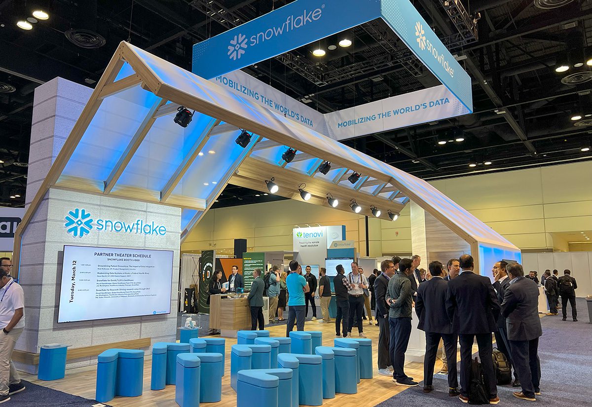
Data cloud company Snowflake built a house façade for its exhibit layout. Each of the roof’s wood beams were embedded with blue light strips that created a snowy look on the white panels. Several multidirectional light fixtures attached to the roof added spotlights to signage and elements in the booth, including a well-lit presentation space with rows of blue arrow seats. When arranged in a circle of six, the arrows would create the Snowflake logo.
ATERA
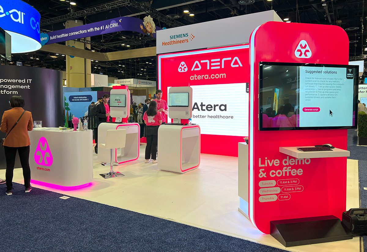
How do you stand out amid a sea of blue and green booths? Think pink—that’s the strategy Atera chose to differentiate its booth from cool-toned competitors. No one did color like Atera, integrating the hot pink from its logo into wall backgrounds and light accents around and below its display structures. The IT management platform also went with rounded edges for its build and brought a space-themed AI game for attendees to try. (Learn more about gamified experiences from the HIMSS24 show floor here.)
BEST BUY HEALTH
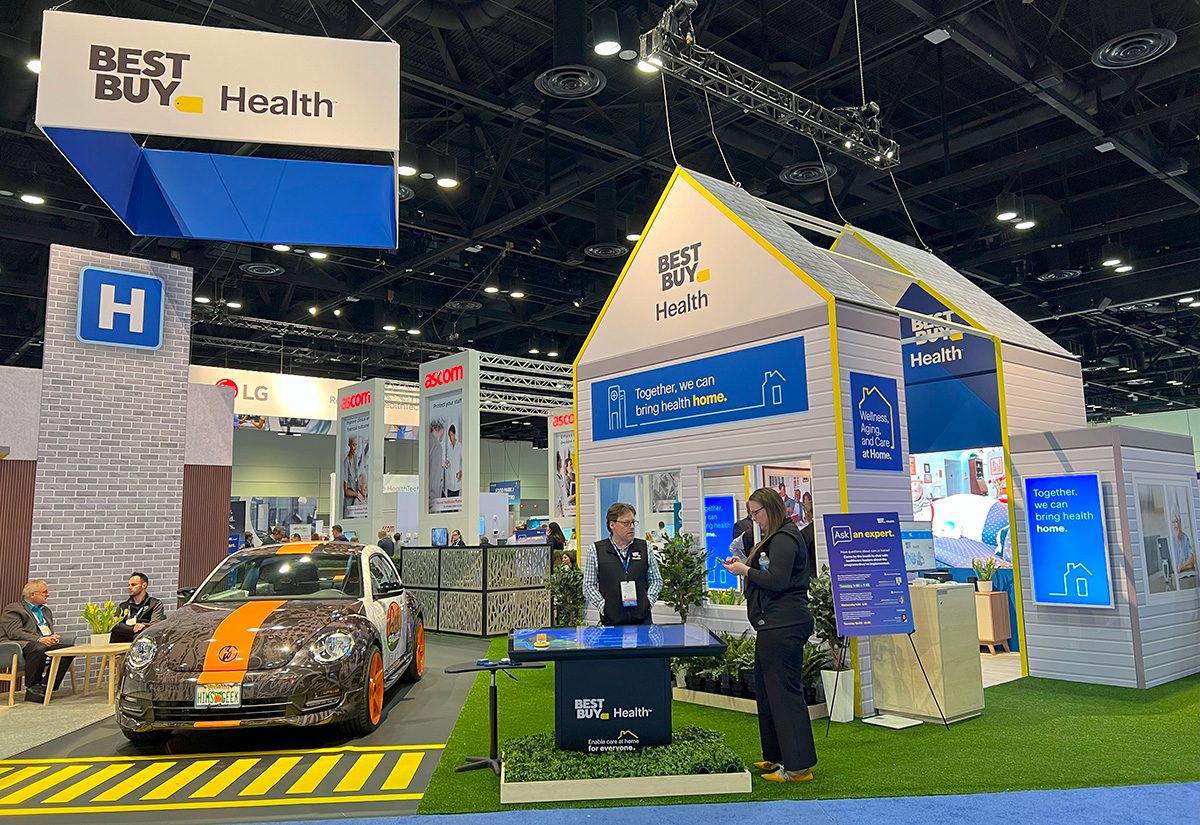
Best Buy rolled its iconic Geek Squad VW bug onto the show floor as part of its large booth space divided into a hospital, street and house, all to show how the brand “can bring health home.” The hospital area was used for demos, meetings and engaging with brand ambassadors and experts, while a yellow crosswalk led to the house structure made up of siding, digital windows, furniture and a garden.
STOLTENBERG CONSULTING INC.
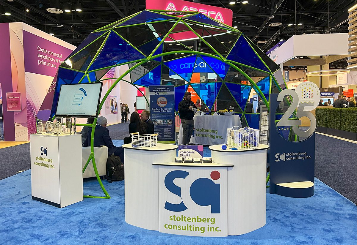
A geodesic dome drew us to Stoltenberg Consulting’s booth. The design incorporated its logo colors in the structure’s thin green beams and dark blue interlocking triangle panels. With a small footprint, the translucent dome added dimension and cover to an interior seating and snack area. (Check out SCI’s swag offerings here.)
UKG
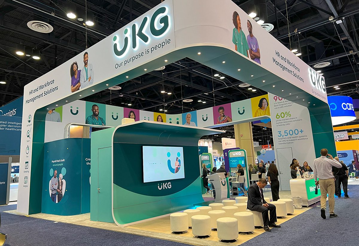
HR and workforce management solutions company UKG incorporated a variety of shapes into its modular design, including cylindrical seating in its presentation area, curved display walls and podiums, and rectangular signage with rounded corners. Images of smiling medical professionals around the band that wrapped above the exhibit added a human element not found at most booths.
KYRUUS HEALTH
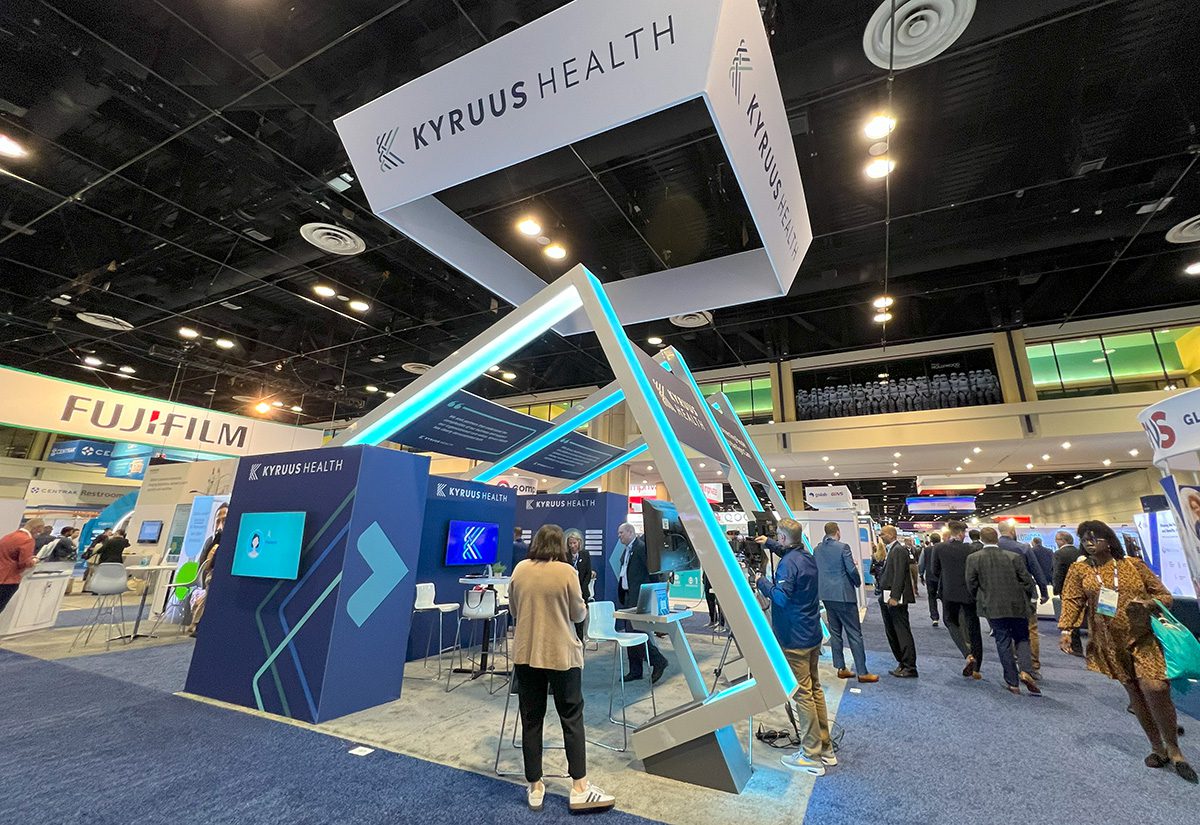
Software company Kyruus Health stood out with uniquely angled blue-illuminated beams that created the look of three large tilted squares. The pointed booth design carried through displays featuring arrows and interlocking triangles from its logo.
